Content Management and Art Direction for Fundler
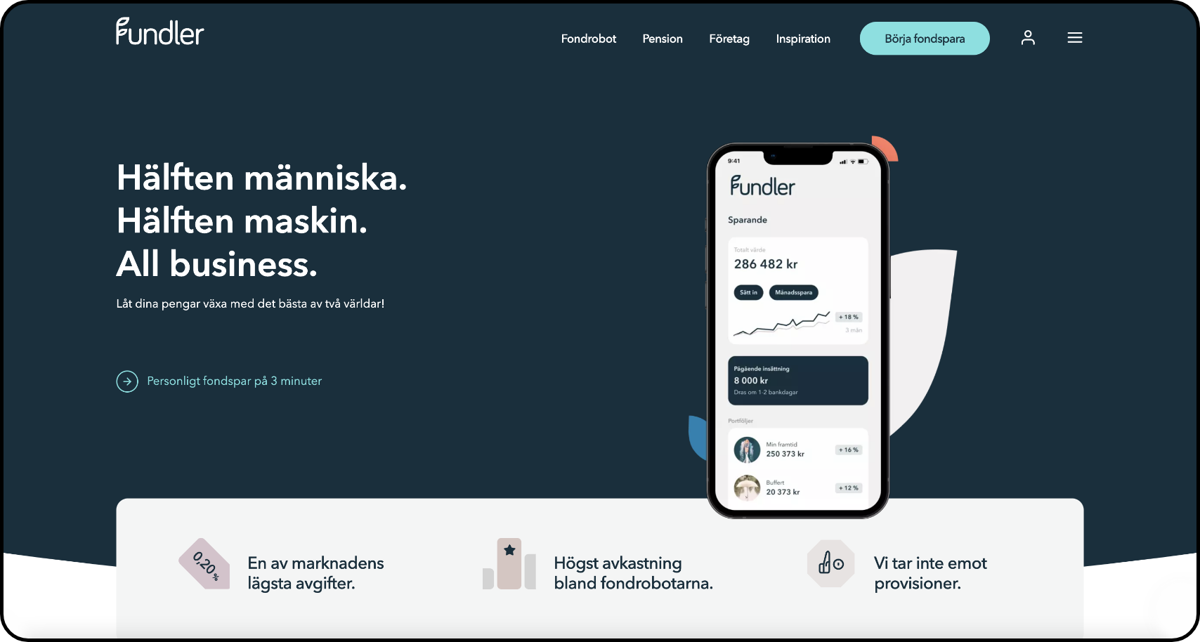
Fundler offers a range of carefully chosen investment portfolios that are constantly optimized by a computer program to match your desired level of risk. These portfolios are selected and managed by a team of investment professionals.
The company had an existing graphic manual in need of stricter and clearer guidelines. The content of the various channels needed to be structured and conceptualized both editorially and visually. To create a more time-efficient work process, drag-and-drop templates were developed for every concept and all channels. This is the result.

Color palette

We chose a dark base color for our visual guidelines because it provides a strong foundation and a sense of sophistication. The dark color adds a level of gravitas and professionalism to the overall aesthetic. We paired the dark base color with light pastel colors to add a touch of whimsy and playfulness, creating a balance between the two elements. The light pastel colors also help to add a fresh, modern feel to the design. Overall, the combination of a dark base color and light pastel accents creates a visually striking and cohesive aesthetic that is both timeless and on-trend.


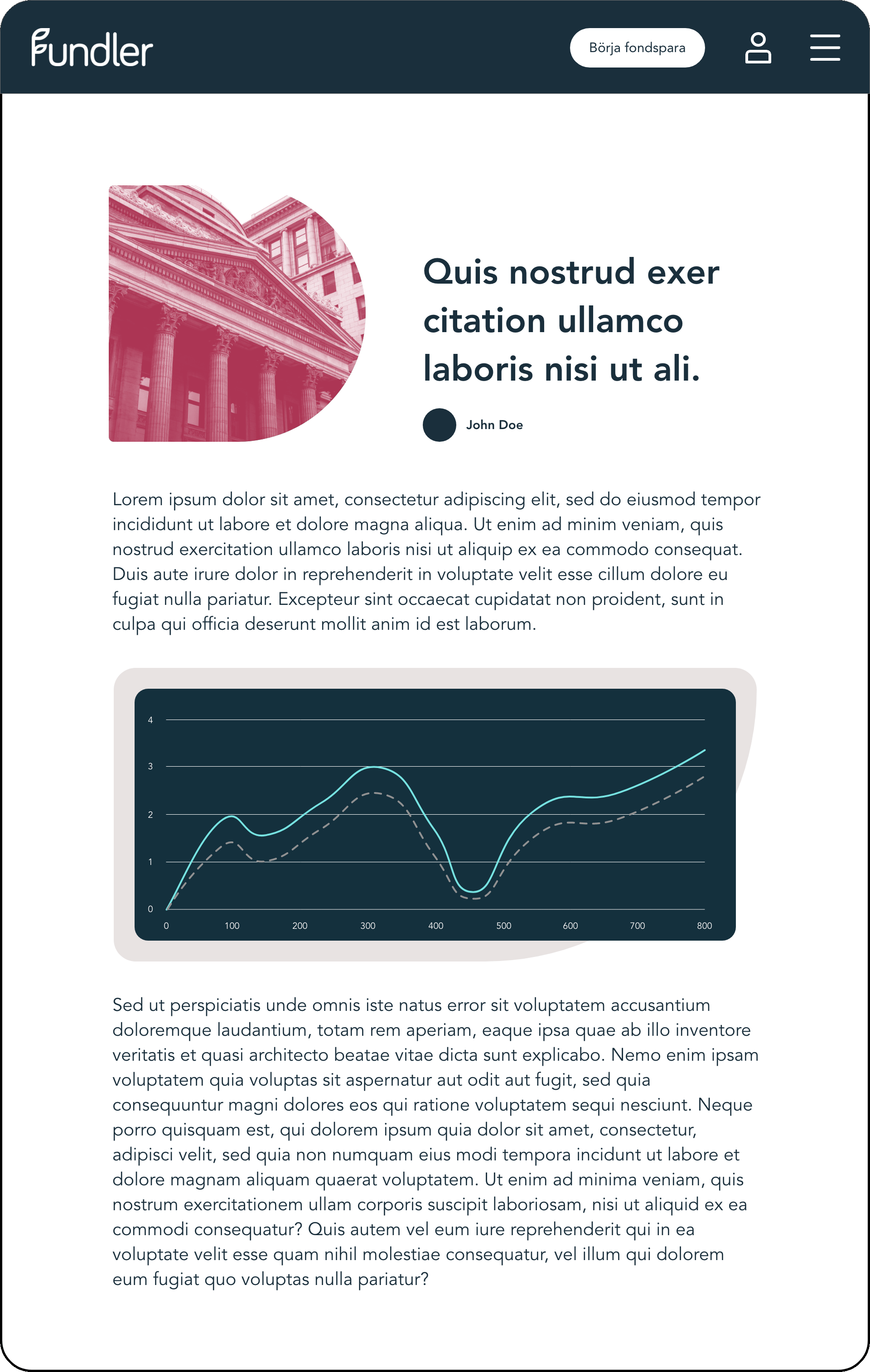
Blog posts
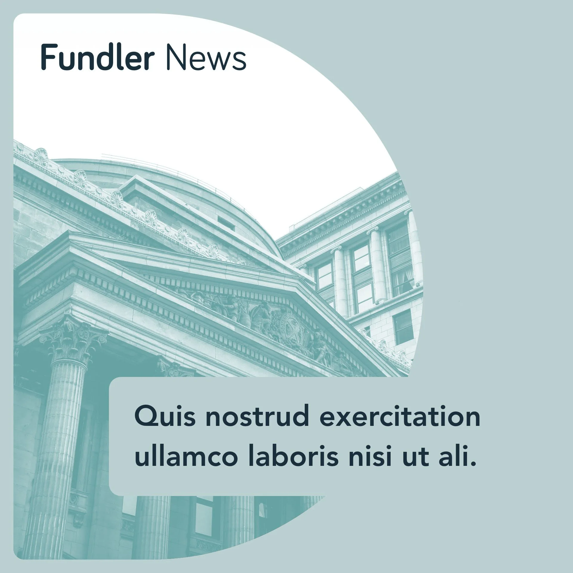


Social media news
CRM
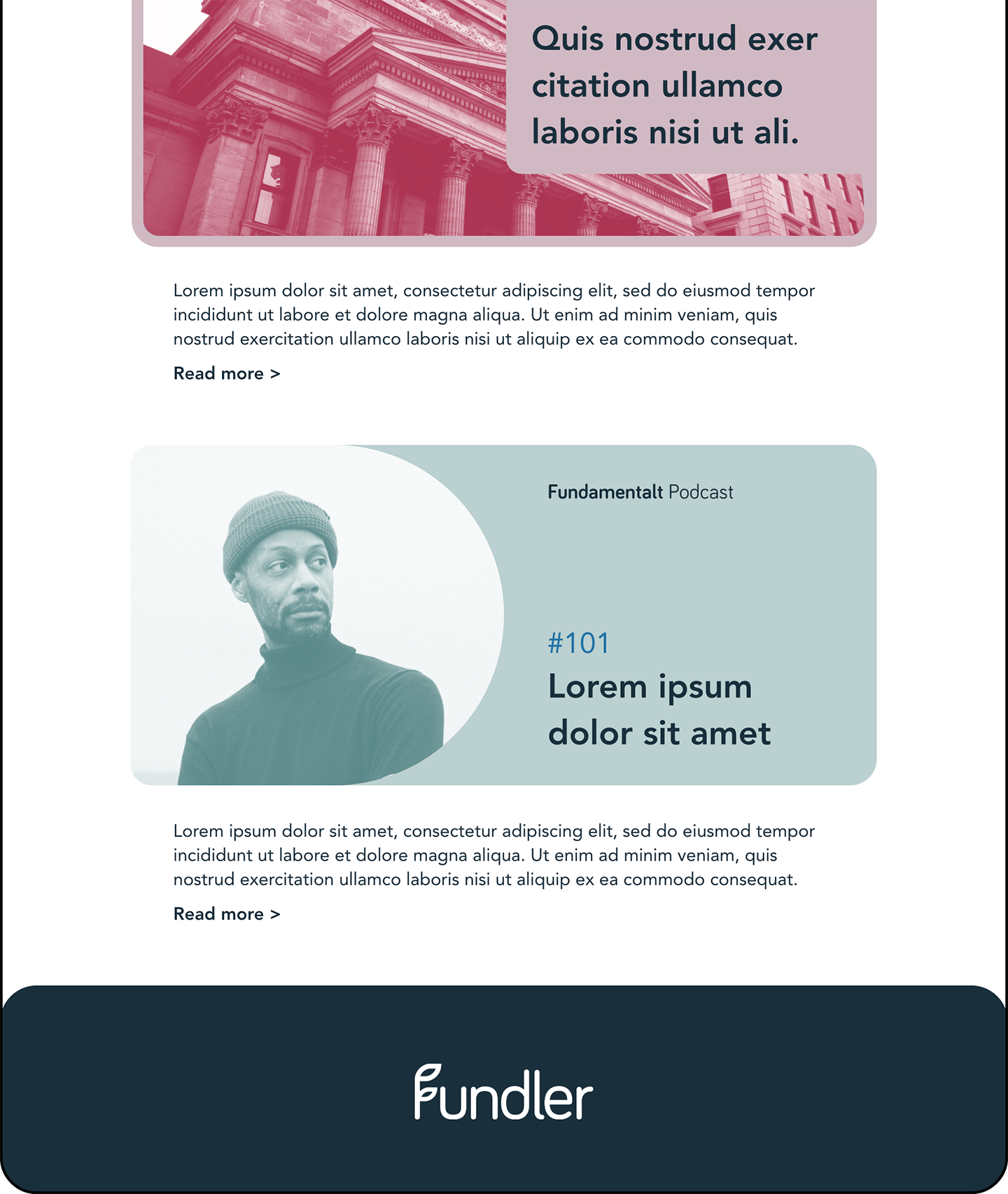

Podcast